ASKATE FOUNDATION
BRAND IDENTITY DESIGN // STUDENT WORK // ART DIRECTION: DAVID JONES // 2017
the challenge
Choose a nonprofit in need of a rebrand. Create an entirely new brand experience and provide print and digital assets.
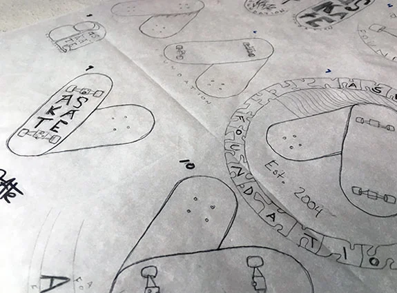
The approach
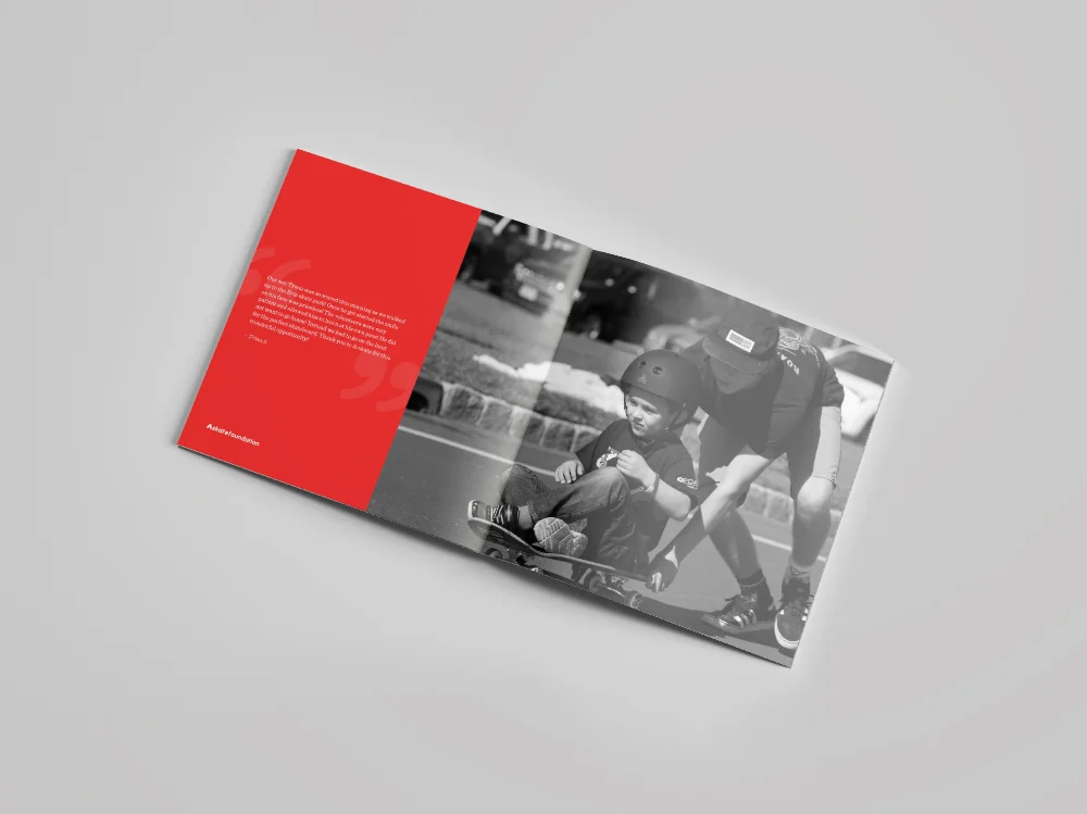
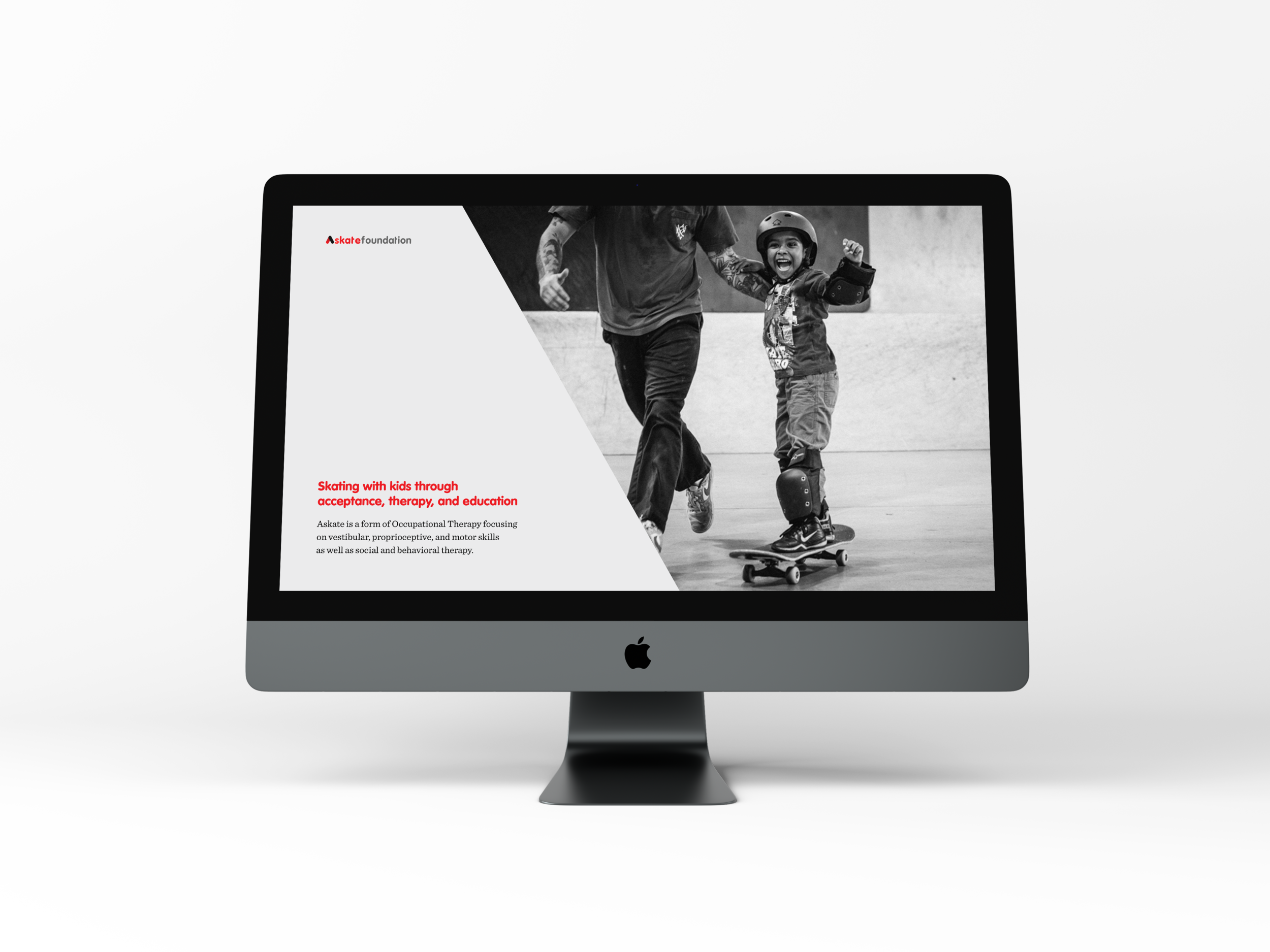
The Askate Foundation holds autism friendly skateboarding clinics to get children on a board. The owner, Crys Worley founded this organization when she realized how therapeutic skating was for her child. They break the traditional rules of skating and allow participants to ride on their feet, butt, or belly!
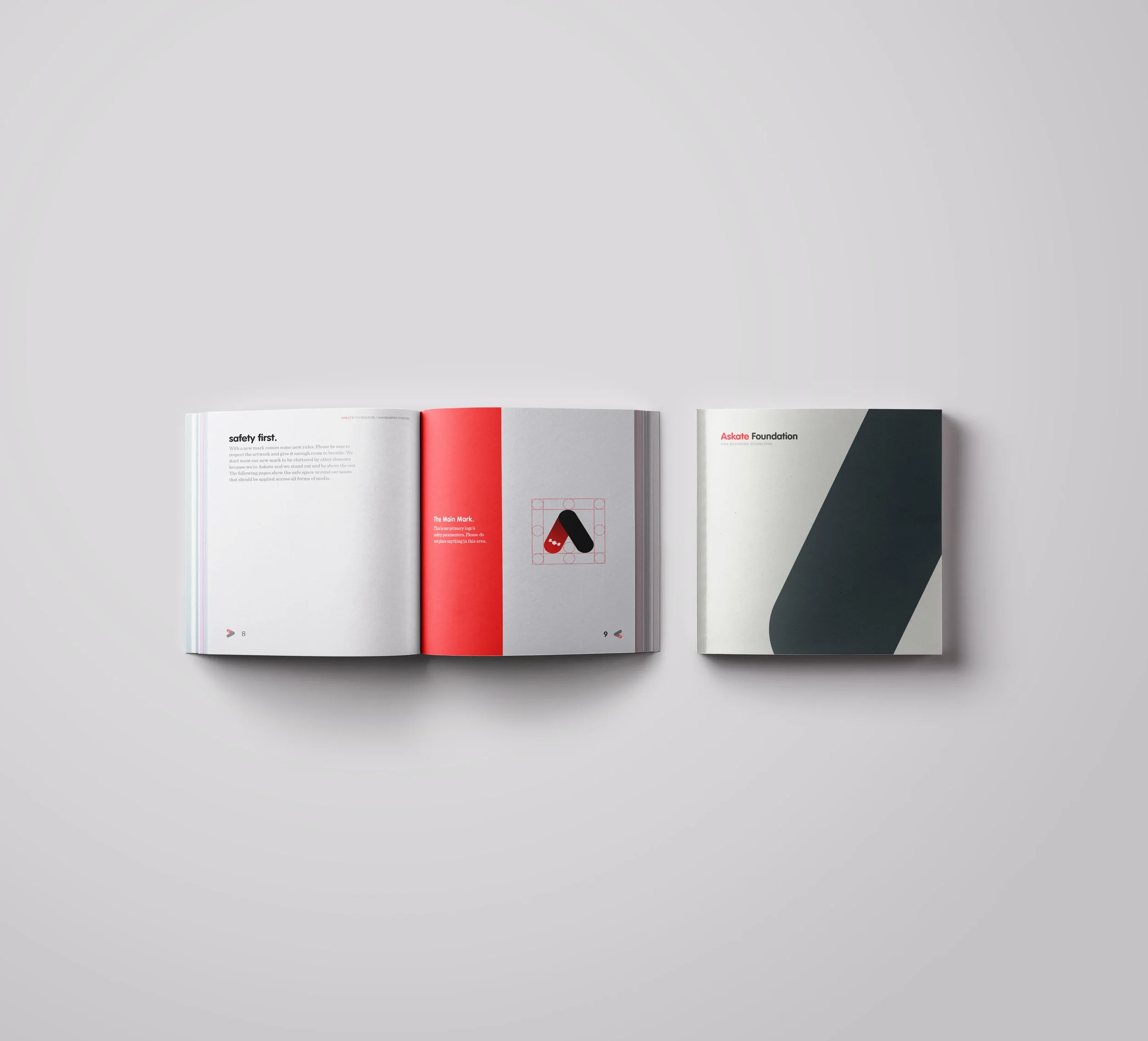
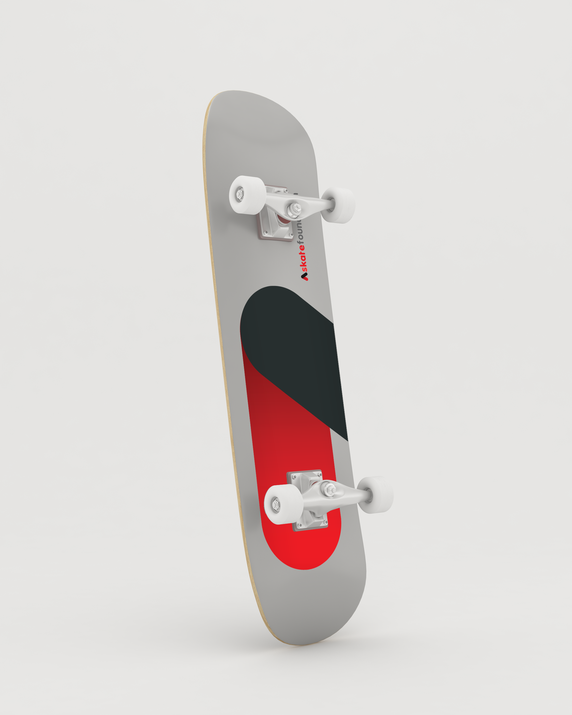
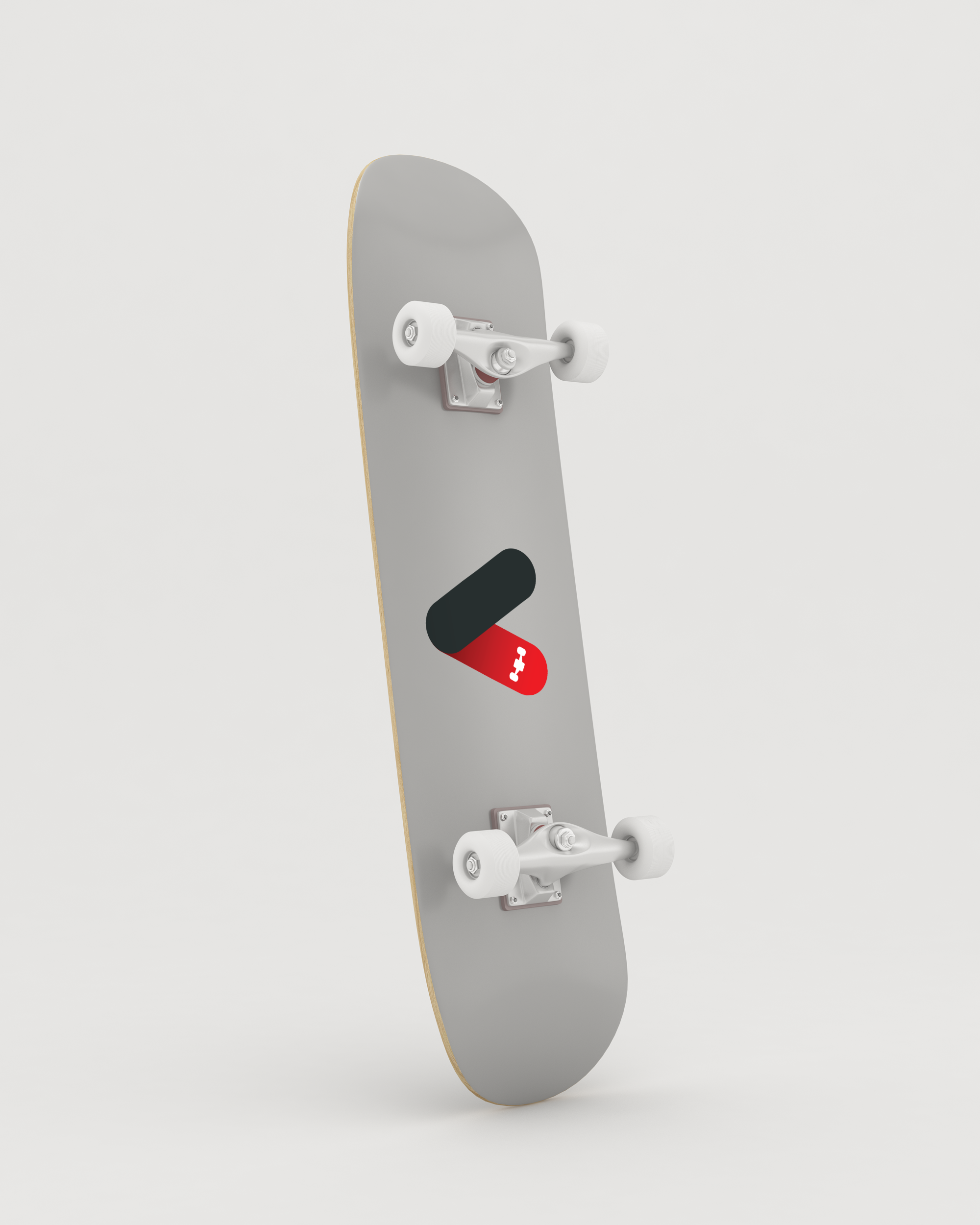
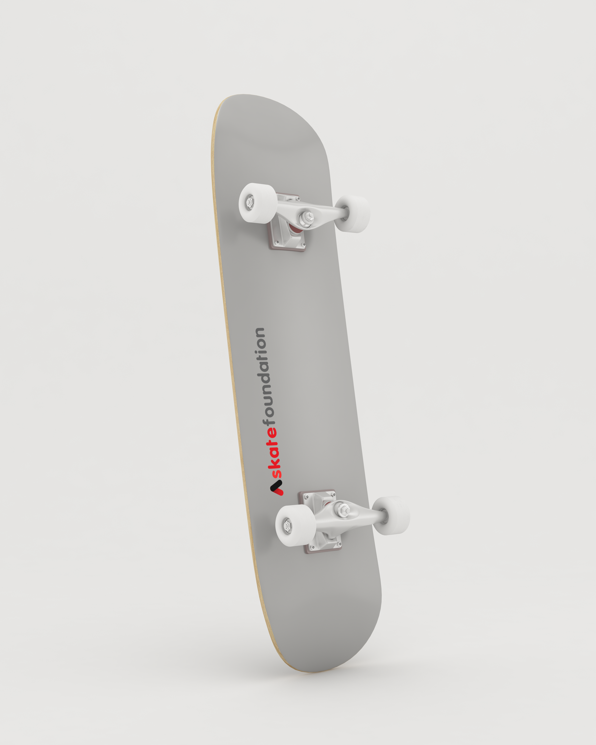
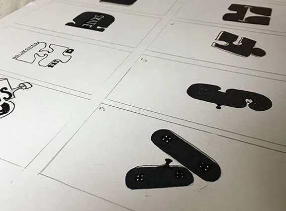
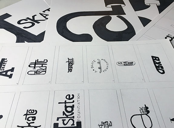
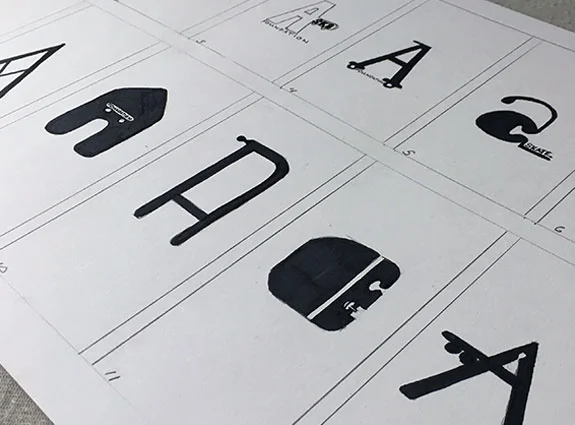
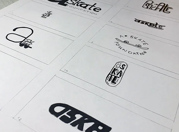
The current branding was uninviting, hard to read and dated. When setting out to create the new brand, I wanted to create something that was clean, friendly and modern. I chose to use the shape of a skateboard to form the A. The red color is used to represent the positive energy both the skater and volunteers bring, while the black represents the power and control given to the kids being able to ride on a skateboard.
The Results
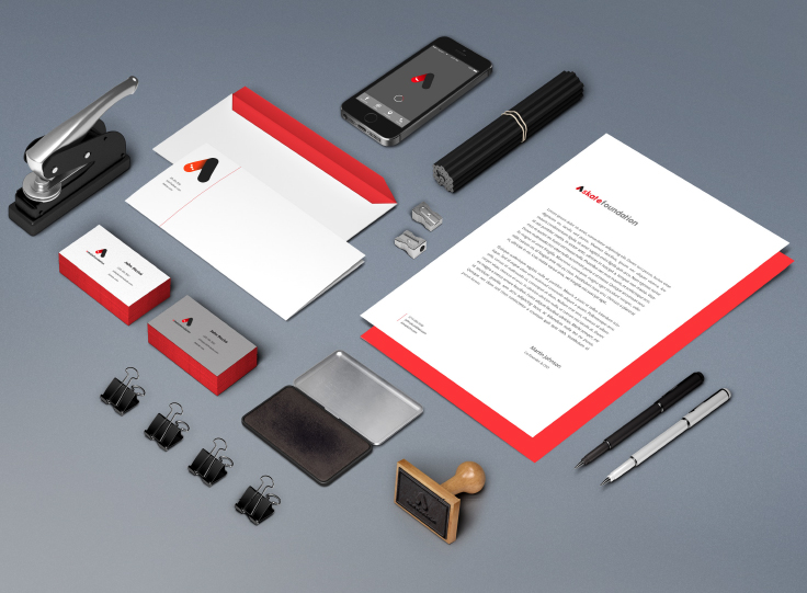
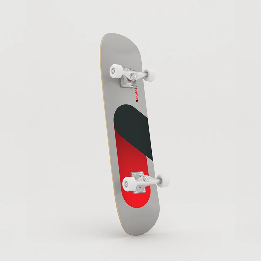
An updated brand image that worked in modern applications for the new digital age. I reached out to Crys Worley showing the updated brand image and she was absolutely thrilled. She was beyond thankful for the work I had put into the updated image. Final deliverables include: Brand guidelines, stationery set, skateboard mockups and a new website mockup.
OLD LOGO
NEW Logo
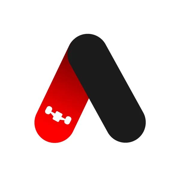
ICON
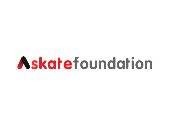
WORDMARK